ShopDreamUp AI ArtDreamUp

Deviation Actions


Suggested Deviants


Suggested Collections


You Might Like…


Featured in Groups


Description
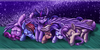
Because Fluttershy is kind. HAH! Get it?
( ͡° ͜ʖ ͡°)
( ͡° ͜ʖ ͡°)
Image size
1920x1080px 1.19 MB
Comments19
Join the community to add your comment. Already a deviant? Log In
To begin this critique, I regret that I must point out the obvious regarding Fluttershy artwork in general-- much like the rest of the mane six, there's thousands of different pieces made of one member of the mane six as fan art. It grows in all directions, and some look almost exactly like the television show, as does this one. However, some do not seem to push their artist's creativity or do them justice in their own style as this one has done for <img class="avatar" src="a.deviantart.net/avatars/i/k/i…" alt="
 " title="ikillyou121" />
Although this heavily resembles the one from the television show, the colours are not as bright and "in your face" if you will; they are much softer, a bit more inviting, and I think that suits the shyest pony of the mane six. I'm sure we all know that Fluttershy would never be so up front about inviting us into an activity with her; moreover, she would be very soft and shy about it, as reflected in the colours present in this piece.
I find it very nice to see her smiling genuinely, as though she has been invited somewhere with a friend or two or perhaps to see some pony she has not for a very long time; regardless, she is spot on accurate to her televised counterpart, and is remarkably cute in this with her gently genuine smile of happiness. Her colours, soft, slightly faded, and gentle, aren't as bright or "in your face" as the crystal cut for the television program, which makes this a very nice touch as I have mentioned earlier.
I have found myself in a tight pinch as the person giving the critique, as all critics thrive splendidly on negative criticism and rarely give out positive; I suppose I'm the first broken critic, as I thrive on the artist as a whole-- their strengths and weaknesses-- to create my critique. I find nothing wrong with this picture in my eyes, and I know many will disagree. I'm not forcing you to accept my opinion regarding this piece of work, but I'm not saying it's the best of all Fluttershy work either; it's certainly one of the best to emulate the television counterpart with much softer colours, making it far more inviting, than some of the others I have seen which are poorly done in an effort to "jump on the band wagon" if you will.
I am delighted with this piece of work, and humbled to have added it to my favourites, as well as been given the opportunity to critique it. I give it five stars all the way, through and through. Brilliantly well done.